Six reasons to ditch your m.site in 2014
In just a couple of short years, m.sites have gone from must-have to must-not-have. Here’s a short history of the m.site and why, if you haven’t ditched yours already, you should make it a priority to retire it in 2014.
The history of the m.site in 64 words
Waaaaay back in 2010, when smartphone users suddenly surged online, site owners realized their pages were brutally slow — or completely non-functional — on mobile devices. Panic ensued. Serving a pared-down version seemed like a logical stopgap solution.So, for a while, if you used a smartphone, the internet looked like this:
 Which wasn’t great, but it was a lot better than this:

Or this:

Today, there’s no excuse for m.sites.
After a couple of years, the votes are in, and most mobile users are vehemently against m.sites. Fortunately, responsive web design and mobile-specific front-end optimization techniques have emerged as solutions for the problems of poor layout/usability and slow performance (though, admittedly, manual implementation of these techniques isn’t necessarily easy).
Before we get into the problems with m.sites, first let’s de-obfuscate a few key terms…
M.site, mobile-optimized, mobile-friendly… wut?
If you’ve ever found yourself stymied by these terms, you’re not alone. Let’s bring some clarity to the conversation.
M.site — Also known as a mobile site, m-dot site, m(dot) site, and various permutations thereof. This is a separate entity from the full site (aka “desktop site” and “main site”), and is usually a stripped-down version of the full site, with simpler navigation, less content per page, and/or fewer pages. When a user attempts to visit a full site via a mobile device, they are automatically redirected to the m.site.
Mobile-optimized site — This term is used nebulously to cover a variety of scenarios — from m.sites to full sites that have been optimized to load faster and/or responsively. My opinion is that this term should be applied only to full sites that have been optimized to perform better on mobile devices.
Mobile-friendly site — I hear this phrase a lot, and it’s even more nebulous than “mobile-optimized”. The problem with “mobile-friendly” is that it sounds great, but it’s so vague as to be almost meaningless. For example, mobile user surveys that ask people if they’re more likely to shop at sites that are “mobile-friendly” or “not mobile-friendly”. Of course people are going to answer “mobile-friendly”. I would, too! But this leaves site owners completely open to interpret “mobile-friendly” in whatever way is most convenient to them. M.site? Yeah! Responsive site? Sure! Simply capable of loading in a mobile browser? Works for me!
So, to summarize:
- M.site = not good
- Mobile-optimized = good (so long as we’re talking about an optimized version of the main site)
- Mobile-friendly = great as a philosophical goal, but not as a specific descriptor for a type of site
What? You’re still not convinced that m.sites aren’t the answer to your mobile performance problems? Read on…
1. Up to one-third of your visitors are going to go to your full site anyway.
That’s right. According to research we conducted a while back, analyzing millions of ecommerce transactions on our customers’ sites, 35% of mobile users will choose to view the full site when given the option.
2. Mobile shoppers spend up to 5.5 times more on the full site than they do on the m.site.
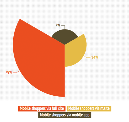
In the same study, we found that mobile users who shop the full site spend much more than those who shop the m.site. We found that, for every $7.00 of mobile-generated revenue, $5.50 (79%) was generated by mobile shoppers using the full site. Only $1.00 (14%) came via m.site, and $0.50 (7%) via the mobile app.

3. When it comes to making pages faster, m.sites don’t help as much as you’d think.
In Radware’s 2013 State of the Union for Mobile Performance, we found that the median full-site load time on the iPhone 4s was 7.84 seconds, and the median m.site load time was 4.33 seconds. While the m.site was 44% faster than the full site, it still didn’t meet users’ wait-time threshold of 4 seconds or less. Why? Two reasons: Redirects and latency.
Let’s talk about redirects first. Unless users are specifically typing in your m.site’s URL, they’re being redirected from your full site to your m.site. Redirecting takes time. (As Google performance guru Ilya Grigorik says, “The optimal number of redirects for mobile is exactly zero.”)
Now let’s talk about latency. The median m.site page we tested contained 27 resources (e.g. images, CSS, etc.) – in other words, approximately one-third the number contained in the median full-site page. Given this, you might expect the m.site to be three times faster than the full site; however, other factors, such as latency and download speed – both of which can be very inconsistent on mobile devices – contribute to performance. For people using 3G networks, Ilya Grigorik states that you should assume 2 seconds of latency right out of the gate.
The takeaway is that site owners need to know that that simply stripping down their sites into pages with fewer resources is not a performance cure-all.
4. Google doesn’t like m.sites.
Speaking of Google… yeah, Google doesn’t like redirects, hence Google doesn’t like m.sites. If you care about SEO, then you should ensure that each page of your site has only one URL.
5. M.sites make cross-platform sharing ugly.
Ever click on a link that one of your Facebook friends posts to their feed from their phone? And then discovered that it was a link to an m.dot page? But you’re on a PC or tablet? Uh-huh.

Or let’s look at this problem from the other end… have you ever been using Facebook on your phone, clicked on a link that one of your friends posted from their desktop, and then seen something like this?

This is what happens when we build websites in silos. Put it another way: Back when laptops arrived on the scene and site owners suddenly had to change their understanding of the range of specs they had to accommodate, did you ever hear anyone say, “I know! Let’s build a laptop-only version of our site!” (I hope you didn’t, but if you did, I sincerely want to hear that story.)
6. Managing multiple sites, each with unique content requirements, is a pain.
This practice — called “forking” — isn’t just difficult, it also makes you more susceptible to mistakes. Most CMSes aren’t cut out to handle the complexity of populating different design templates with different content, so maintaining an m.site means that you’re managing two distinct entities. This means that you need to apply all the same considerations — including identifying content requirements; writing and editing copy; sourcing, sizing, and formatting images; conducting usability tests; engineering performance, etc. — for every page of TWO separate sites. I don’t know of any site owner who is fully doing this. More often than not, the m.site is either an afterthought or a side project, when in fact mobile deserves its own share of focus.
Resolution for 2014: One web to rule them all
As I’ve said elsewhere, we live in a mobile-first world. But equally important, we live in a multi-screen world. 90% of people move between devices to accomplish a goal, and these devices are increasingly fragmented. Device fragmentation isn’t going to disappear. The line between phone, tablet, and laptop is only going to get blurrier. Siloed websites are not the solution, and as more time passes, siloed websites are poised to create more and more problems — from a usability perspective, from a back-end perspective, and from all points in between.
Over the past twenty-odd years, we’ve been spoiled as technology has evolved to give us unparalleled processing power, networks, and browsers. We’ve luxuriated in this… reveling in video, massive high-res image files, JavaScript out the yin-yang, and hundreds of resource calls across dozens of hosts. Page bloat is real, and it’s out of control.
Here’s a scary and exciting thought: Mobile is going to force us to radically rethink how we build websites and web-based apps. Let’s embrace it. Even if mobile devices and networks get ten times faster, people don’t want to — or can’t — digest the amount of content we’re currently throwing onto desktop screens. Screen size won’t allow it, and if you’re actually, you know, out there being mobile, you don’t want to sit down and read it all. (And my personal theory: I don’t think people want all this out-of-control content on their desktop, either.)
Let’s make 2014 the year that we desegregrate the web. No more mobile web. No more desktop web. Just one web — and let’s make it as fast, efficient, and beautiful as we can.
