Waterfalls 101: How to use a waterfall chart to diagnose your website’s performance pains
If you’ve been following along with this site over the past four years, you may recall this post, which offered an introduction to waterfall charts. Given that the post is now a few years old, I think it merits a refresh.
Who this post is for
If you already live and breathe waterfalls, this post isn’t for you. (But this one might be.) This post is for people who are interested in performance but don’t necessarily have a lot of technical know-how. It’s for people who want to crack the hood and learn:
- why pages behave the way they do,
- how to begin to diagnose performance issues before sending out red-flag emails to everyone on your team, and
- how to talk performance with the experts within your organization who do live and breathe waterfalls.
What is a waterfall chart?
A waterfall chart is any diagram that represents data that is generated cumulatively and sequentially across a process. A performance-specific waterfall chart lets you see the series of actions that occur between a user and your server in order for that user to view a specific individual page of your site.
Each page resource — from HTML to images, CSS, JavaScript, and other scripts — is represented in its own line on the chart. The waterfall shows the moment when each resource is called from the server straight through to the moment when it has been downloaded and rendered in the browser. (If you’re a project manager or someone accustomed to using Gantt charts, performance waterfalls are somewhat similar in that they depict a cascade effect among interdependent page elements. For example, a page can’t begin to download resources until it has completed its DNS lookup and established a TCP connection.)
Almost every performance measurement tool generates waterfalls. (I want to say everymeasurement tool does, but there may be exceptions I’m not aware of.) If you’re brand-new to the concept of waterfalls, you can create your own very easily simply by entering your URL in a free online performance test like WebPagetest.
Why you need to know how to read a waterfall
If you care about how fast your pages load, then you need to have at least a basic understanding of waterfalls. That’s because waterfall charts are a critical diagnostic tool for your web pages. Pages can be slow for a myriad of reasons, from a sluggish back end to latency to unoptimized third-party scripts that block the rest of the page from rendering. If your site feels slow, you can quickly run your own tests, generate waterfalls, and get a good idea of where the problem lies before you flag the problem with other members of your team.
What this post will help you with
This post won’t make you an expert on waterfalls. Ideally, you already have experts within your organization who can interpret the nuances of your site’s waterfalls and implement the appropriate performance fixes. This post will help you understand those people. It will also help you know what kinds of questions to ask in order to get a deeper understanding of your site’s performance. And as mentioned above, it will also teach you how to do a bit of sniffing if you suspect your pages of having performance issues.
Waterfalls: The good, the bad, and the ugly
Let’s follow the picture-is-worth-a-thousand-words principle.
The good
As a general rule of thumb, a good waterfall has few bars, and the bars are relatively short. This indicates that the page is lean and each resource downloads and renders fairly quickly. A good waterfall looks something like this:
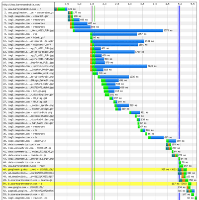
Looking at this waterfall, we see that this page contains 34 requests. The time to first byte (or TTFB, more to come on this later in this post) is around 0.2 seconds, which is pretty good. Time to start render is 2.4 seconds, and document complete time is just under 4 seconds (again, more on these terms later). As pages go, it could be better, but it’s still better than most.
The bad
A bad waterfall is a waterfall that has a combination of (1) more resources, and (2) slower resources. I won’t bother including an image of one here, because I expect you can visualize it well enough on your own. Instead, let’s skip ahead to the ugly, because it’s pretty spectacular.
The ugly
Behold, the Niagara Falls of waterfall charts. You might want to take a few seconds to flex your scrolling finger before you check this out.
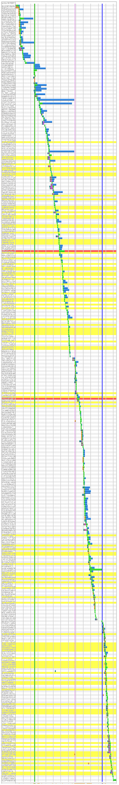
This majestic beast contains a total of 335 resource requests. (Compare this to a typical ecommerce page, which contains around 100 requests.) Time to first byte is 0.7 seconds, time to start render is around 5 seconds, and document complete time is 23 seconds. Yikes. If a waterfall for a page on your site ever looks like this, it’s time to hit the panic button.
But… here’s the caveat
The difference between a good page and an ugly page is about more than just the number of resources. It’s also about things like:
- how much latency these resources experience,
- the order in which they render on the page, and
- whether or not they block other resources.
It’s important to bear in mind that you can have a waterfall with very few bars, but if it experiences any of these problems, then you might be in no better shape than our Niagara Falls example up there.
And this neatly leads up to the meat of this post…
How to interpret a waterfall chart, part 1: Understand basic performance measurement terms
Before getting into how individual page resources load, first let’s get three key performance measurement terms straight:
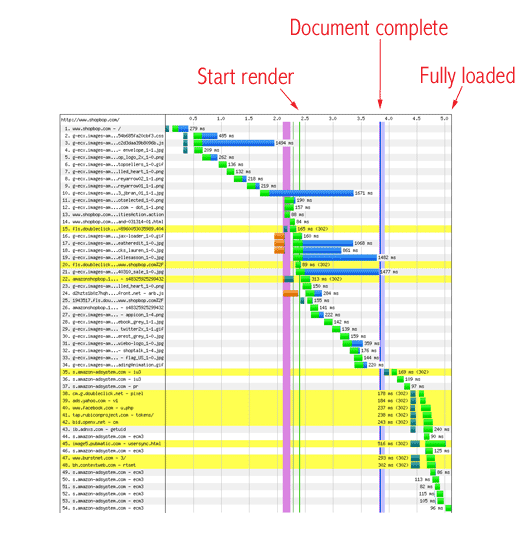
Start render: Indicates when content begins to display in the user’s browser. Note that start render doesn’t indicate whether the first content to populate the browser is useful or important, or simply ads and widgets.
Document complete: The time it takes for most page resources to render in the browser. It’s measured when the browser fires something called an “onLoad event” after most page resources have fully loaded. It’s used as a primary measuring stick for site performance, but isn’t necessarily an accurate indicator of when a page becomes interactive.
Fully loaded: This is the moment that all page resources, including third-party tags that aren’t visible, have loaded and the page is complete.
How to interpret a waterfall chart, part 2: Know your colors
When you look at the colored bars on a waterfall chart, there are four things to pay attention to:
- The number of orange bars
- The number of bright green bars
- The length of the bright green bars
- The number of blue bars
Each of these colored bars represents a different activity that happens as the object is delivered to the user’s browser. And each of these colored bars can tell you a useful story about how that specific page resource performs.
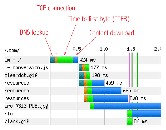
Dark green = DNS lookup
This is when the browser looks up the domain of the object being requested by the browser. Think of this as asking the “phone book” of the internet to find someone’s phone number using their first and last name.
How to use the dark green bar to identify problems: You can’t do much about the dark greens bars and they shouldn’t be a problem on most sites.
Orange = TCP connection
Also called the three-way handshake, this is the process by which both the user and the server send and receive acknowledgment that a connection has been made and data can begin to be transferred. It’s not easy to speed up the TCP connection, but you can control how many times the connection takes place. This is a good thing to do, because too many connections will slow down performance.
How to use the orange bar to identify problems: If every other bar on your chart has orange in it, that’s too many orange bars. You can address this problem by having your developers use something called keep-alives to reduce the number of TCP connections. (If you want more details about keep-alives, feel free to email me or ask in the comments.)
Bright green = Time to first byte
This is the window of time between when the browser asks the server for content and when it starts to get the first bit back. The user’s internet connection is a factor here, but there are other factors that can slow things down: the amount of time it takes your servers to think of what content to send, and the distance between your servers and the user.
How to use the bright green bar to identify problems:
- Too many bright green bars. This is caused by having too many resources, each of which requires its own server round trip before it can be rendered in the browser. There are a number of techniques to address this problem, such as consolidating page resources so that fewer bundles need to be sent over the wire, and leveraging the browser cache so that the user isn’t calling for the same resources over and over on subsequent pages in their visit.
- Bright green bars are too big. You have a latency problem. You can fix this problem with a CDN, which will bring your content closer to your users. Chances are, you’re already doing this. Hopefully, this post will help show that while a CDNs can be a great resource to have in your toolset, they don’t address all aspects of the performance problem.
Blue = Content download
This is the time it takes for each page resource to be completely sent from the server to the browser.
How to use the blue bar to identify problems: If there are too many blue bars in your chart, then not only does the page contain too many resources, but each of these resources is too large. This problem can be fixed using a number of performance techniques, from fundamental best practices like resource compression to advanced treatments like auto-preloading. (Again, let me know if you have questions about these techniques.)
Takeaway: 5 goals for every waterfall chart
Remember that when you’re looking at performance reports for your site, you want to see these five things:
- The vertical “start render” and “document complete” lines should occur as early as possible, and these lines should be as close to each other as possible.
- As few rows as possible.
- As few orange bars as possible.
- Bright green bars that are as few and as short as possible.
- As little blue as possible.
This is a looong post, and I can appreciate that it’s a lot to digest all at once. If you have questions about any of this, let me know.


