There are more mobile-optimized sites than ever. So why are mobile pages getting bigger?
My recent post about page growth (or page shrinkage, as the case may be) hit a nerve with a lot of people, so this week I thought I’d take my first dive into the Mobile HTTP Archive, the mobile counterpoint to the HTTP Archive I cited last week. The Mobile HTTP Archive tests the same list of URLs, but it does so using smartphones. This means that if a URL redirects to a mobile site, the Archive tests the mobile site.
Just like last week, I looked at the top 1,000 URLs. What I found won’t come as a surprise to anyone who’s been following this blog for a while. While there are many similarities between these findings and last week’s, there are also a number of insights that are unique to mobile devices.
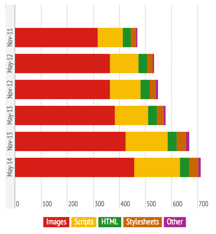
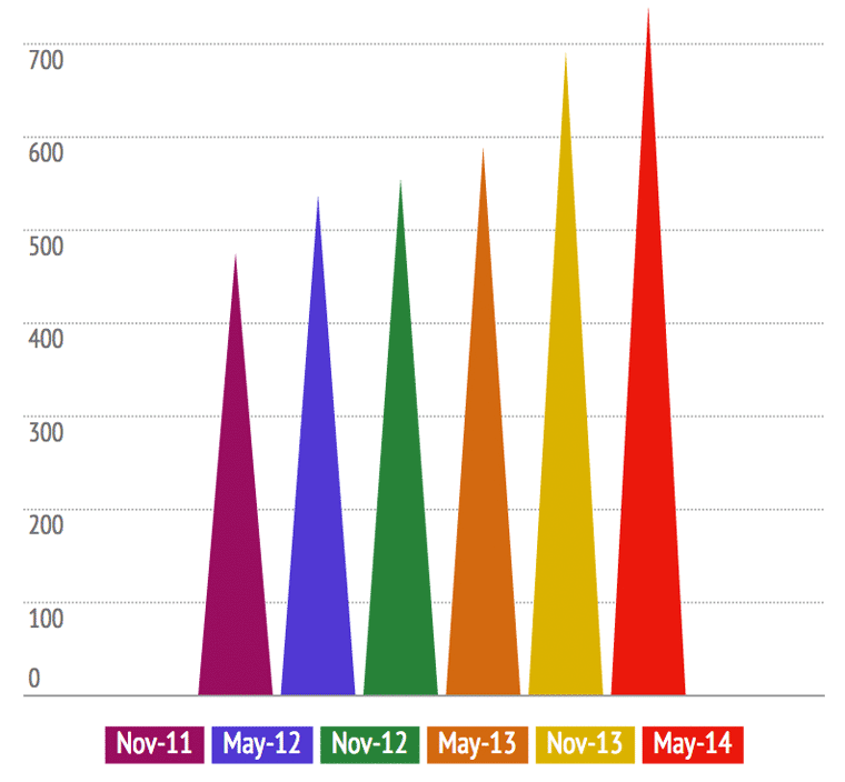
To start, here’s a bird’s-eye view of page growth and page breakdown over the past two and a half years:
There are more mobile-optimized sites than ever. So why are pages getting bigger?
1. The average page being served to mobile devices is 56% bigger than it was in 2011.
In November 2011, the average page served to a mobile device was 475 KB. Not terrible. Now it’s 740 KB, a 56% increase. This may not sound like much in a world where we’ve gotten used to 1.5 MB pages being pushed to our desktops, but put that number in the context of your data plan and think about it again.
2. Images comprise 62% of the average page’s total payload.
In 2011, the average page served to mobile contained 317 KB in images, compared to 457 KB today. This may sound like images are out of control, but in 2011 images comprised 67% of a page’s total payload, so this sort of looks like progress. Sort of. Chances are, there’s still a lot of room for improvement. As I talk about endlessly, images are a huge performance roadblock. They don’t have to be.

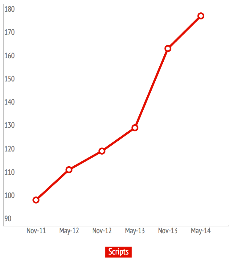
3. Scripts have almost doubled since 2011.
No surprise here, either. In the past two years, the web has gone crazy for third-party scripts. In November 2011, the average page contained 96 KB worth of scripts. Today, that number has grown to 175 KB — almost 24% of the average page’s total weight.
Not all of these scripts are from third parties, of course, but I’m calling out third party scripts because I don’t think they get taken seriously enough by the people who implement them. Third-party content doesn’t have to be a performance bad guy, but site owners need to be aware that every “simple” single line of code they inject into their pages creates another potential point of failure. You don’t need to reject third-party scripts, but you do need to plan ahead how you’re going to mitigate their risks.
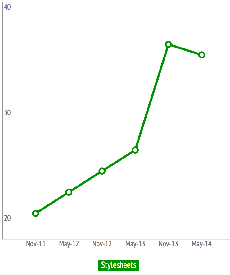
4. Stylesheets are on the rise.
At least some of this growth can be attributed to the rise in popularity of responsive web design. At 35 KB, stylesheets aren’t exactly bandwidth hogs, but they can hamper performance in a number of other ways — from being in the wrong location on the page to being placed in multiple files. Ideally, your stylesheets should make your pages better and faster, not slower. Here are some tips on how to make them work for you.
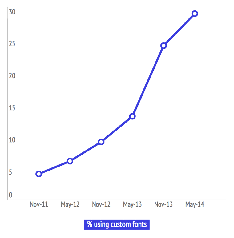
5. Use of custom fonts has increased by 625%.
In 2011, only 4% of pages served to mobile devices used custom fonts. Today, that number has exploded to 29%. If you care about serving faster pages to your mobile visitors (and if you’ve read this far, I’m assuming you do), then you need to ensure that your custom fonts aren’t messing up performance. Some fonts require massive amounts of CSS code, while others have super-heavy JavaScript. Both of these incur a major performance hit.
The safest approach is just to disable custom fonts for mobile devices. If you absolutely must use them, do it sparingly — perhaps focusing solely on headers and important typographical elements. Some good tips on choosing custom fonts for mobile devices.
Takeaway
Page size, third-party scripts, custom fonts, stylesheets… these are issues that plague pages delivered to both desktop and mobile users. I’m going to strongly make the argument that, as much as you care about the performance hit these things can impose for desktop users, you should care even more about how they affect mobile users.
More than half of all time spent on retail sites is logged on mobile devices, and more than half of all online consumers now multiscreen during the purchasing process. This means you need to ensure that your site is delivering a fast, consistent user experience across all platforms. With so many mobile performance factors — such as latency, bandwidth, and device — out of your control, the one thing you can control is how your pages are built.


