New findings: For top ecommerce sites, mobile web performance is wildly inconsistent
Mobile has never been more crucial to business success than it is right now.
Chances are, you’ve been exposed to some version of this statement so many times that you’re probably (understandably) immune to it. But it bears repeating:
Mobile has never been more crucial to business success than it is right now. Brace yourself for a barrage of stats that prove it:
- One out of four people on our planet own a smartphone.
- More than half of all time spent on retail sites takes place on a mobile device.
- The average online shopper makes 6.2 visits to a company’s website, using 2.6 devices, before they buy.
- Just a one-second delay in mobile load times can hurt conversions and cart size by up to 3.5%.
- Slow pages also drive mobile shoppers to the competition, with 30% of dissatisfied shoppers saying they will never return.
- 65% of consumers say that a poor online experience has a direct impact on their opinion of a brand.
This is why sites need to perform quickly and consistently across all platforms. This is why it’s critical for site owners to have visibility into the real-world mobile performance of their sites. And this is why, every year at Radware, we study the mobile performance of the top 100 ecommerce sites to see how they measure up to user expectations.
Our latest report — the 2014 State of the Union: Mobile Page Speed and Web Performance — is now available for download. Today, I want to share some of our key findings and takeaways.
Background
Measuring mobile performance is extremely challenging — much more so than measuring desktop performance. Here’s how we tackled mobile performance measurement for this research:
In July and August, we engaged in a four-week study of the top 100 retail websites, as ranked by Alexa.com. Using an online tool called WebWait, which measures load times in real time, we subjected the home page of each site – both the full-site version and the m-dot version – to ten page speed tests each, and we used the median numbers for each set of tests. We tested on a variety of Android and iOS smartphones and tablets (using their native browsers) over 4G and Wifi networks. If this sounds incredibly laborious, that’s because it was.
We also looked some other numbers, such as which sites serve m-dot and t-dot versions of their pages to smartphones and tablets.
The goal of this research was to gain an understanding of how the world’s most popular ecommerce sites perform for real users in real-world settings, outside of development and testing environments.
The results were eye-opening. We found that performance on mobile devices is wildly inconsistent across devices and platforms.
Both m-dot sites and full sites fail to meet user expectations.
Almost half of mobile users expect pages to load in 2 seconds or less, and 40% will abandon a page that takes longer than 3 seconds to load.
We found that — regardless of the type of site, device, or network — the median site in each batch of tests failed to meet user expectations:
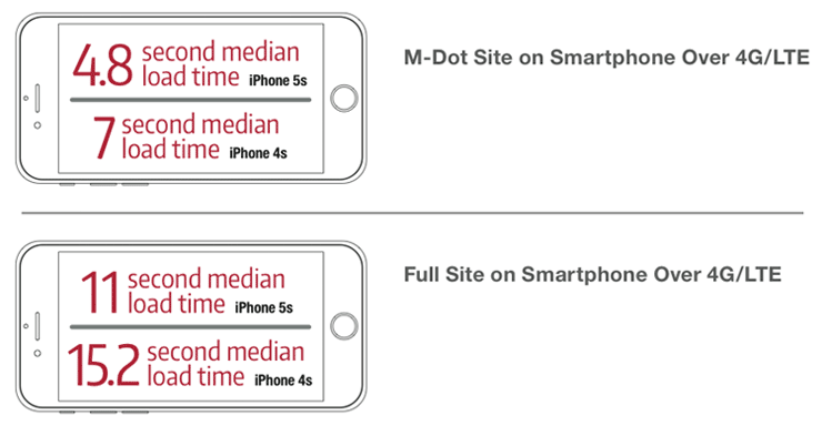
- Among the top 100 retail websites, the median m-dot page took 4.8 seconds to load on the iPhone 5s, and 7 seconds to load on the iPhone 4s (over LTE).
- The median full-site page performed much worse than the median m-dot page, taking 11 seconds to load on the iPhone 5s and 15.2 seconds on the iPhone 4s.
- Only 2% of full-site pages loaded in the ideal time of 4 seconds or less on the iPhone 4s.
- 15% of full-site pages loaded in fewer than 4 seconds on the iPhone 5s.
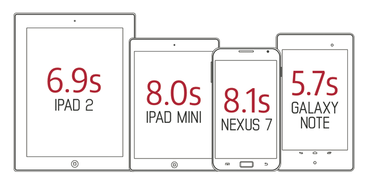
Median load times also varied across tablets, ranging from 5.7 seconds for the Galaxy Note to 8.1 seconds for the Nexus 7.
IMPORTANT: These tests are most emphatically not intended to be taken as performance reviews of the devices we tested on. Rather, they demonstrate how broadly performance can vary across mobile devices, with the slowest device performing three times more slowly than the fastest device. Site owners need to be aware that this degree of variance exists among their users so that they can prioritize performance testing their pages across a range of devices and connection types.
As device fragmentation continues to accelerate, website fragmentation also continues.
When I see graphics like this one, via OpenSignal, which illustrates the current state of Android fragmentation, I hurt for site owners and developers.
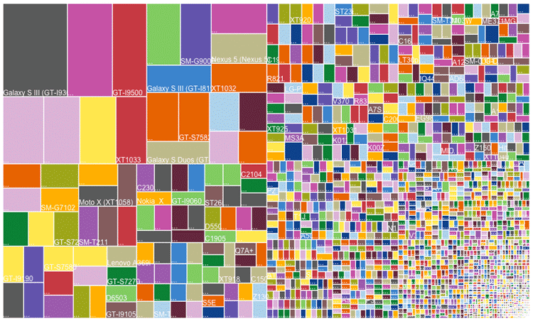
According to OpenSignal’s data, the number of distinct devices that have downloaded their app grew by almost 60% in just one year — from 11,868 in 2013 to a staggering 18,769 in August 2014. This graphic beautifully (if painfully) illustrates the massive challenge faced by developers who are tasked with optimizing sites and apps across platforms and devices.
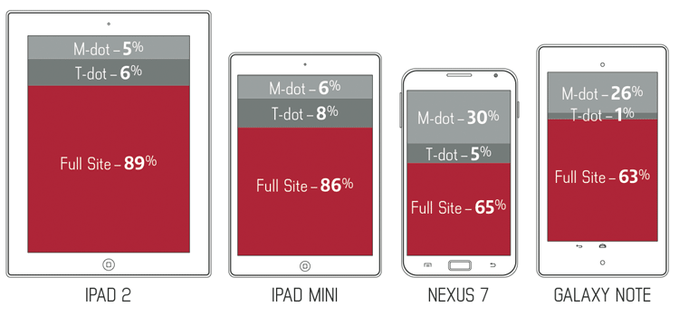
In looking at the top 100 retailers, we found that most are making a brave attempt to serve optimized versions of their sites to the different high-level device categories:
- 81% of the top 100 retailers automatically serve an m-dot version of their site to smartphones.
- Up to 8% serve a t-dot (tablet-optimized) version of their site to tablets.
But among those retailers serving a t-dot version of their site to tablets, the success rate really depends on which tablet you look at. We found that when it comes to delivering the right site to the right device, results are all over the map. Yes, between 6-8% of sites serve t-dot pages to the iPad/iPadMini, but as few as 1% of the top 100 sites served the t-dot site to Android tablets.
What’s worse is the fact that many sites are still serving their m-dot pages to tablets — particularly Android tablets — despite the fact that tablet users expect a desktop-like experience. We found that 5-6% of sites served m-dot pages to the iPad and the iPad Mini, while up to 30% of sites served m-dot pages to Android devices.
Conclusion and takeaways
It’s impossible to emphasize enough the immediacy and urgency of addressing mobile performance. Users expect pages to be at least as fast on their smartphones and tablets as they are on the desktop, and they don’t care about the many factors that limit mobile performance. They don’t care that mobile devices don’t have the processor power to deliver a speedy desktop experience. They don’t care that the browser cache is relatively tiny compared to desktop. And they don’t care about slower networks and greater latency. As far as most mobile users are concerned, that’s our problem to fix, not theirs.
Responsive web design (RWD) further complicates the challenge. A growing number of site owners recognize that maintaining multiple websites is not a sustainable solution. In an effort to create a consistent user experience across platforms, many sites are turning to responsive design. However, responsive websites are complex, and that complexity can come with a serious performance price tag. While it’s quite possible to design a website that is both responsive and fast, these two attributes don’t automatically go hand in hand. Creating a fast responsive site requires a deep understanding and knowledge of both responsive design and front-end performance optimization.
Here’s what I hope people will take away from this report:
- Most sites don’t currently deliver a satisfactory experience on mobile devices.
- There’s no magic bullet for mobile performance.
- Maintaining separate desktop, m-dot, and t-dot sites may not be a sustainable practice in the long term.
- Don’t serve your m-dot site to tablets — that means any tablets, not just iPads.
- Test your site — and test it often — on a variety of devices, browsers, and connection speeds.


